I've always been a fan of Flatlays and i tend to like almost every other #Flatlay photos that i see on my instagram explore page. Sometimes i get so amazed by how much time and effort is being put in into each photo and there are some ig accounts that are purely dedicated (or 90% of their posts) to flatlays like @elpuswr, @Walids, @Designbyaikonik just to mention a few ig accounts that i follow and i never fail to like each and every of their photos.
Anyway if you still have no idea what #Flatlay is about, it's all about laying out your stuff and taking a photos from directly above, basically giving an overview of everything that is laid out. You can go search "#Flatlay" on instagram and you can see a gazillions of examples. Flatlays are amazing but not a lot of people understand the whole process behind each photo which is what i aim to give you an guys an idea of the entire process on how we get the end #flatlay image :)
If you have following me on my instagram (@andystorm) you will realised that my color scheme or theme is pretty much monochrome nowadays. I've always enjoyed doing #Flatlay but i kind of "unable" to do it because it must sort of be monochrome and also because i'm kinda lazy to do it, HAHAHA Anyway, i thought since pretty much all my Adidas shoes are in black and white, why not do a #Flatlay with the shoes and show you guys how it's being done!
Disclaimer: This is not a sponsored post by Adidas. But Adidas PR, if you ever see this post, i just wanna say i love your shoes! LOLOLOL
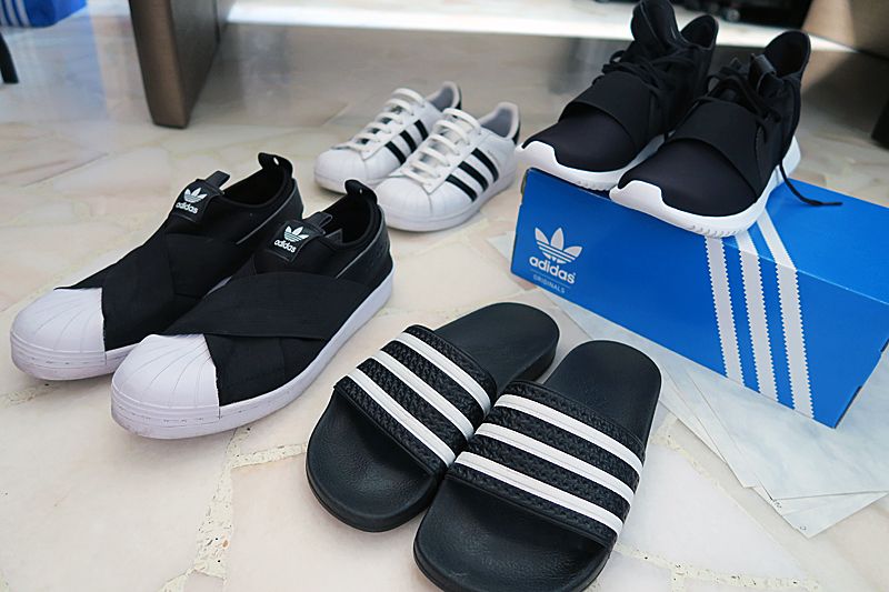
Step 1: Gather the things you need for the #Flatlay. So in my case, i chose 4 of my shoes which are black and white since i already know the color theme i want, and i also prepared some marble inspired paper which i bought from Art Friend ($0.90/ A4 piece) as the background. You can also use Mahjong paper or just spread normal white A4 paper on the ground. Bonus if your floor or table is already white or the color you want (then you can pretty much skip step 2!)
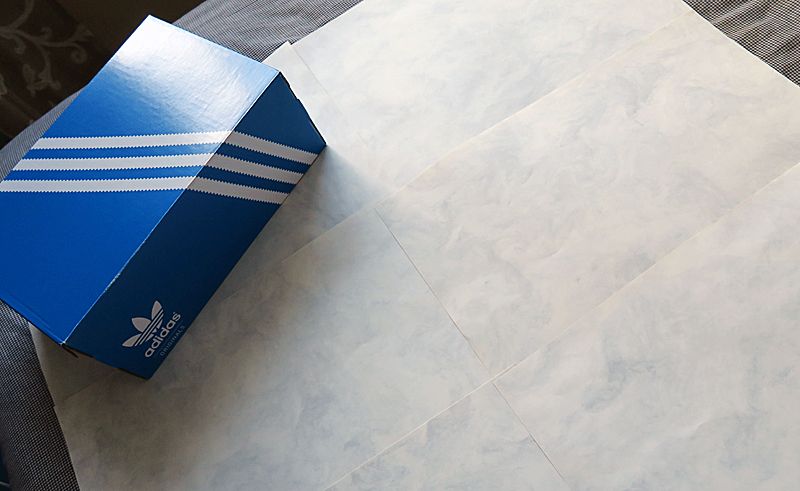
Step 2: Lay out your background. In my case, the A4 marble-inspired paper.
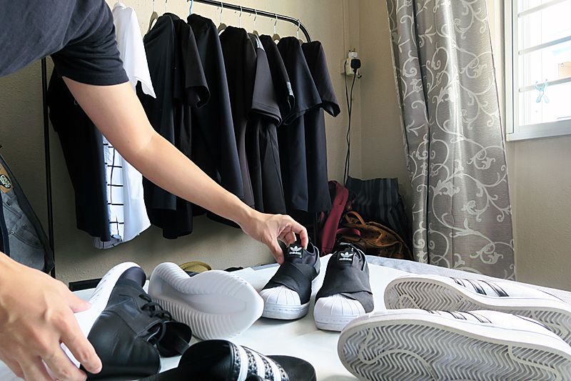
Step 3: Artistically arrange your items. Trial and error until you feel that it doesn't look messy and all over the place. Tip: Do allow some space between each item so the overall image will look aesthetically pleasing. Keep adjusting.
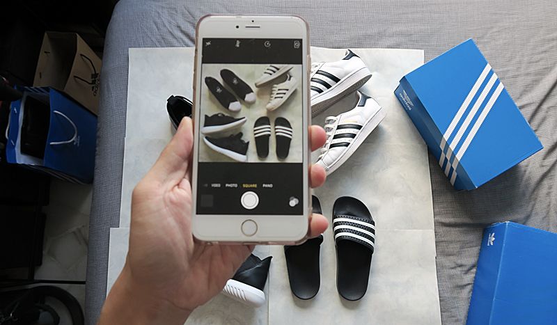
Step 4: As most #Flatlay are mostly square, you can use your iPhone's square camera to see if your arrangement looks pleasing. This is the part where you have to keep adjusting your items to make sure that it fills up the square but at the same time, with enough spaces between them. I felt that my image is a little boring with just the shoes so i went to dig out more accessories to fill up the bigger gabs. Tip: Try to find "relatable" items of the same color scheme,definitely not something bright and bold that might steal the limelight from your main items.
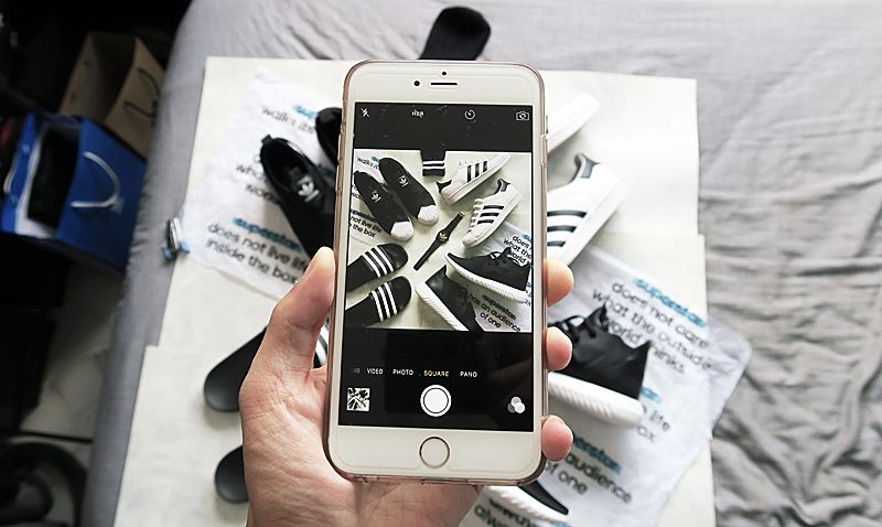
Step 5: Once again, keep checking if the overall arrangement, adjust if need be. For my "accessories", i managed to find my old Adidas watch which is black and gold, a pair of black socks with white stripes and i used the stray paper which came along in my Adidas shoe box. Don't you think with these add-ons, the entire photo looks so much better???
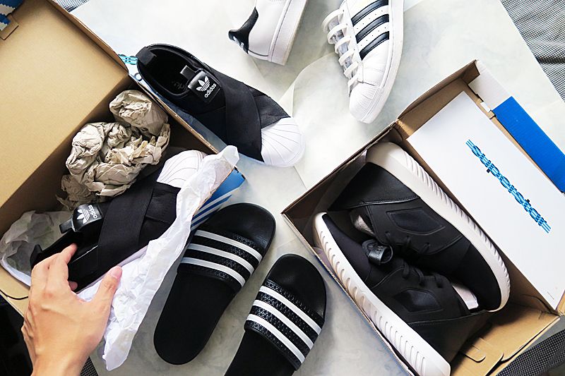
Step 6: The most tedious part. Once you feel that you already got the perfect shot. It's time to put everything back to their original place. Imagine you have items from all over the house, that's when you have to spend some time...
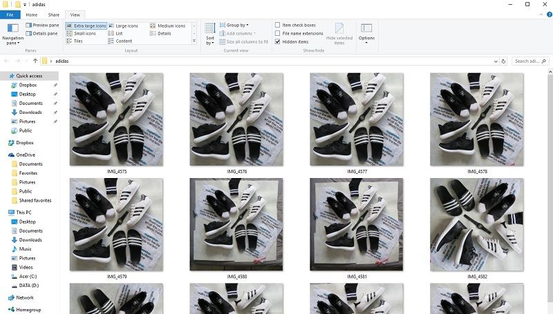
Step 7: Most #Flatlays requires post editing on the computer, simply because one does not spend so much effort in taking the shot but not beautify it. LOL You can expect to see duplicates of your images,in different arrangements, different lighting etc from the collection. Scrutinize one by one and pick out the one that you think is the best of all.
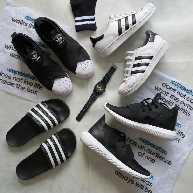
Step 8: Photoshop. The above is the image i have chosen out all of the photos i took previously. There are some obvious flaws in the image which needs to be rectify. For example, the joint-lines cause by the overlapping of my marble paper. I also thought i can blend in the "stray paper" with my background. Edit the lighting of the image, Tip: Use "Dodge" tool to lighten, and "Burn" tool to darken. Smart sharpen the overall image after done editing. You're done!
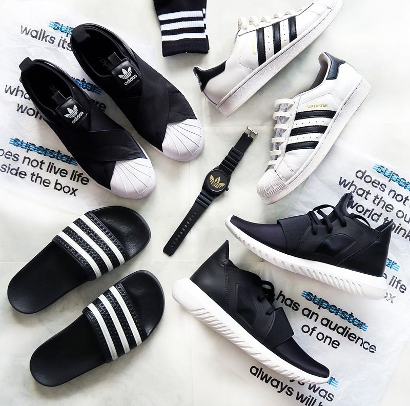
Step 9: Save and Share! The above is the final product of my #Flatlay. I did not mention one thing that i edited which might not be very obvious but it will definitely affect the overall image if i didn't do it. Maybe you might have realized it, HAHA Clue: Stripes. So what do you think of the final image? Is there a big difference before and after?
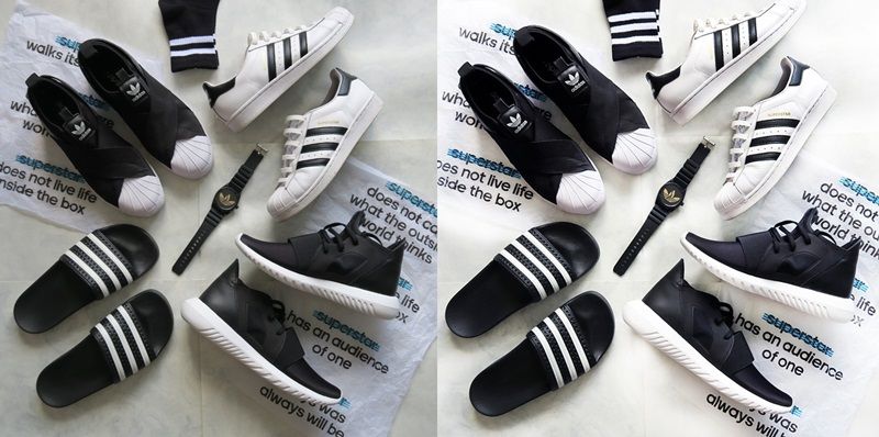
Let me put the before and after side by side.
That's all i have for my simple #Flatlay 101 post. Hope you like it and appreciate every flatlay that you see on instagram! Likes are free anyway so i guess it doesn't hurt to double tap on every flatlay you see! (unless it's really poorly done that maybe not, lol) Follow me on my instagram @andystorm for my monochrome shots and @_akwh for more personal photos! Till the next post, i will try to update my blog more often! :)
Happy New Year,

